
Dingka's Cleaning Services
A cleaning business that had to be findable on one island.
Dingka's Cleaning Services cleans private homes, offices, guest houses and yachts on Praslin, Seychelles. It works on Praslin only, it does not take hotel work, and it accepts bookings on weekends and public holidays.
Three specific facts — and all three are reasons to get in touch. My job was to build a site where a visitor absorbs every one of them before deciding whether to call.
- Client
- Dingka's Cleaning Services
- Sector
- Professional cleaning
- Location
- Praslin, Seychelles
- Scope
- Five-page website
- Language
- English
- Studio role
- Strategy, design and build
The business and the communication challenge
Most service businesses want a website that makes them look larger than they are. This one needed the opposite. Serving a single island exclusively, and turning down hotel work, is not a weakness to hide — it is precisely why a guest-house owner on Praslin can expect someone who already knows the properties there.
The challenge was that those constraints are usually buried. A conventional cleaning-company site would open with a generic promise and leave the service area to a footer, which means the one visitor who most needs to see it never does.
What had to be clear immediately
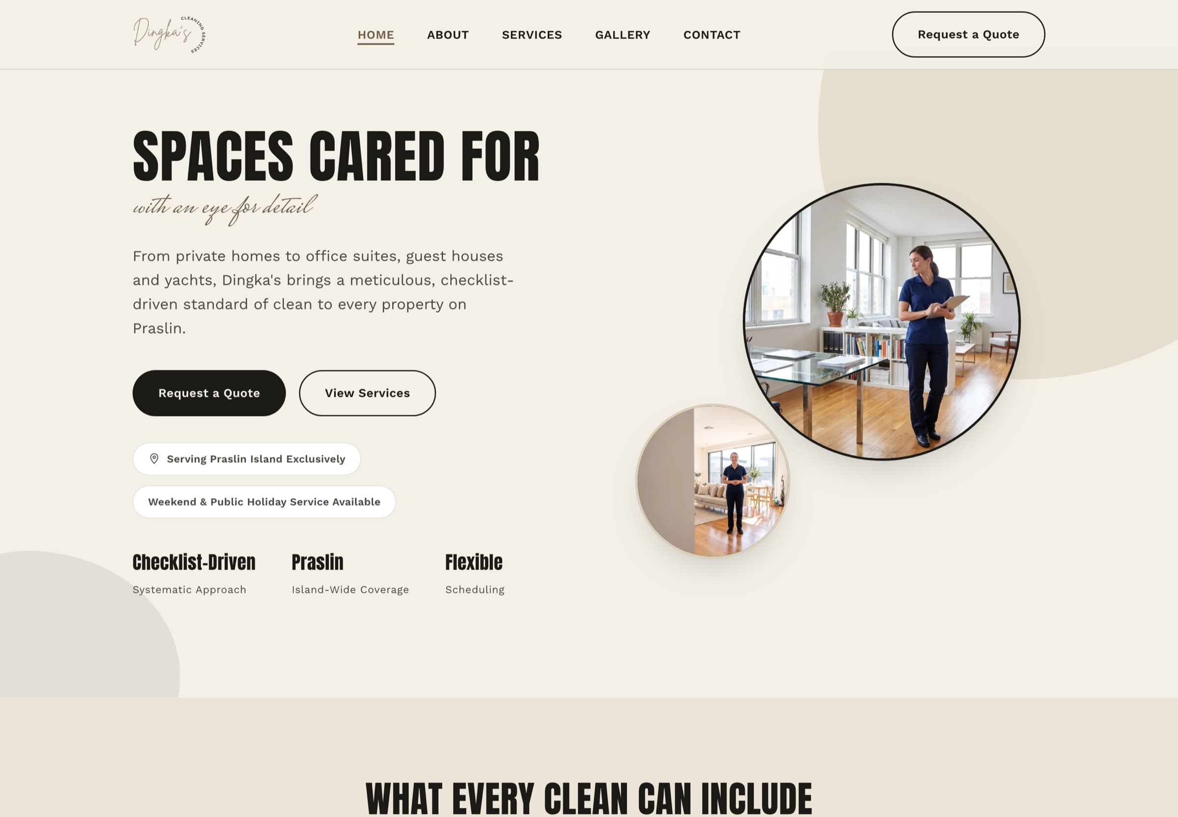
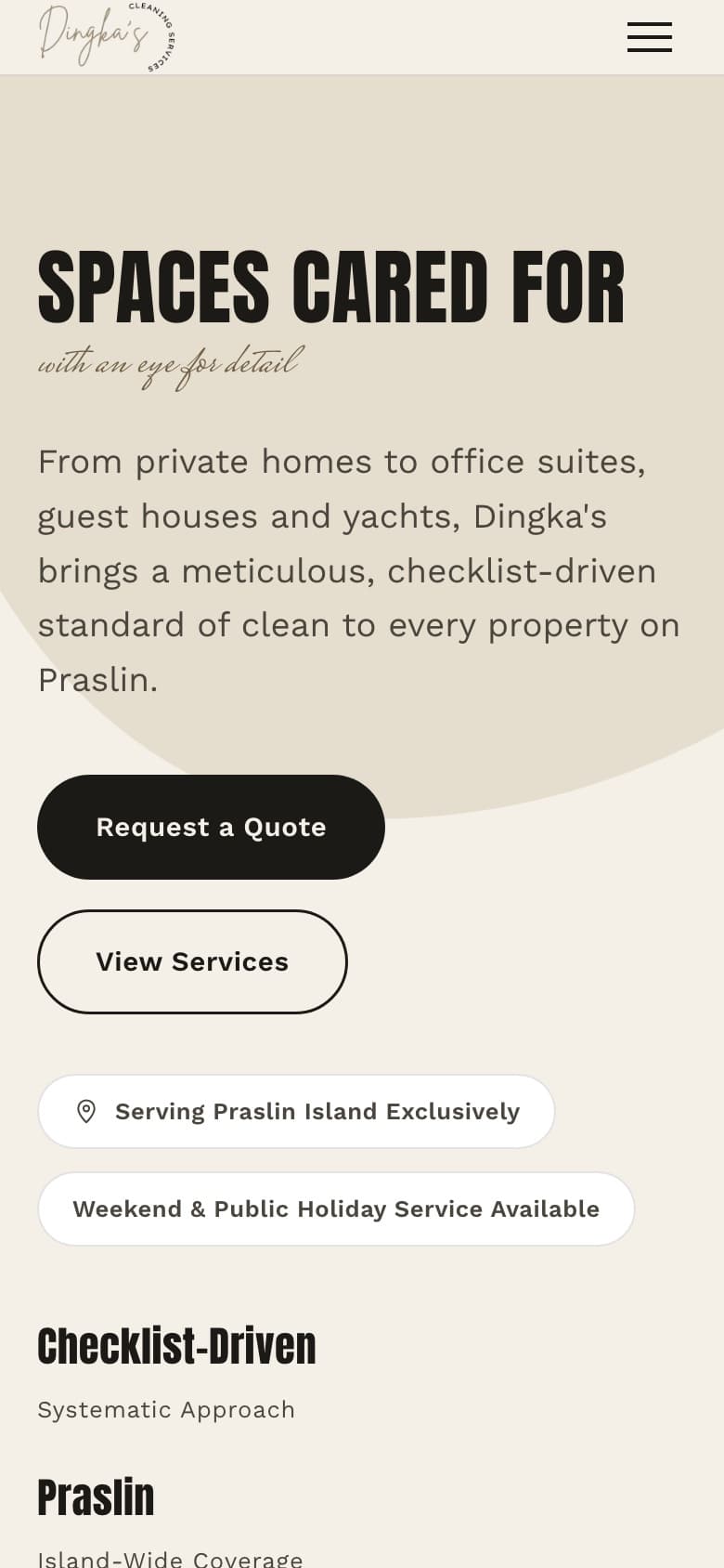
I set three things as non-negotiable above the fold: where the business works, what kind of properties it cleans, and when it is available.
So the service area and the hotel exclusion are stated plainly on the home page rather than tucked away, and the four property types — guest houses, yachts, private homes and offices — are named in the visitor’s own words instead of being dressed up as residential and commercial solutions. Weekend and public-holiday availability is treated as a headline fact, because for this business it is a genuine reason to be chosen.
The design and content approach
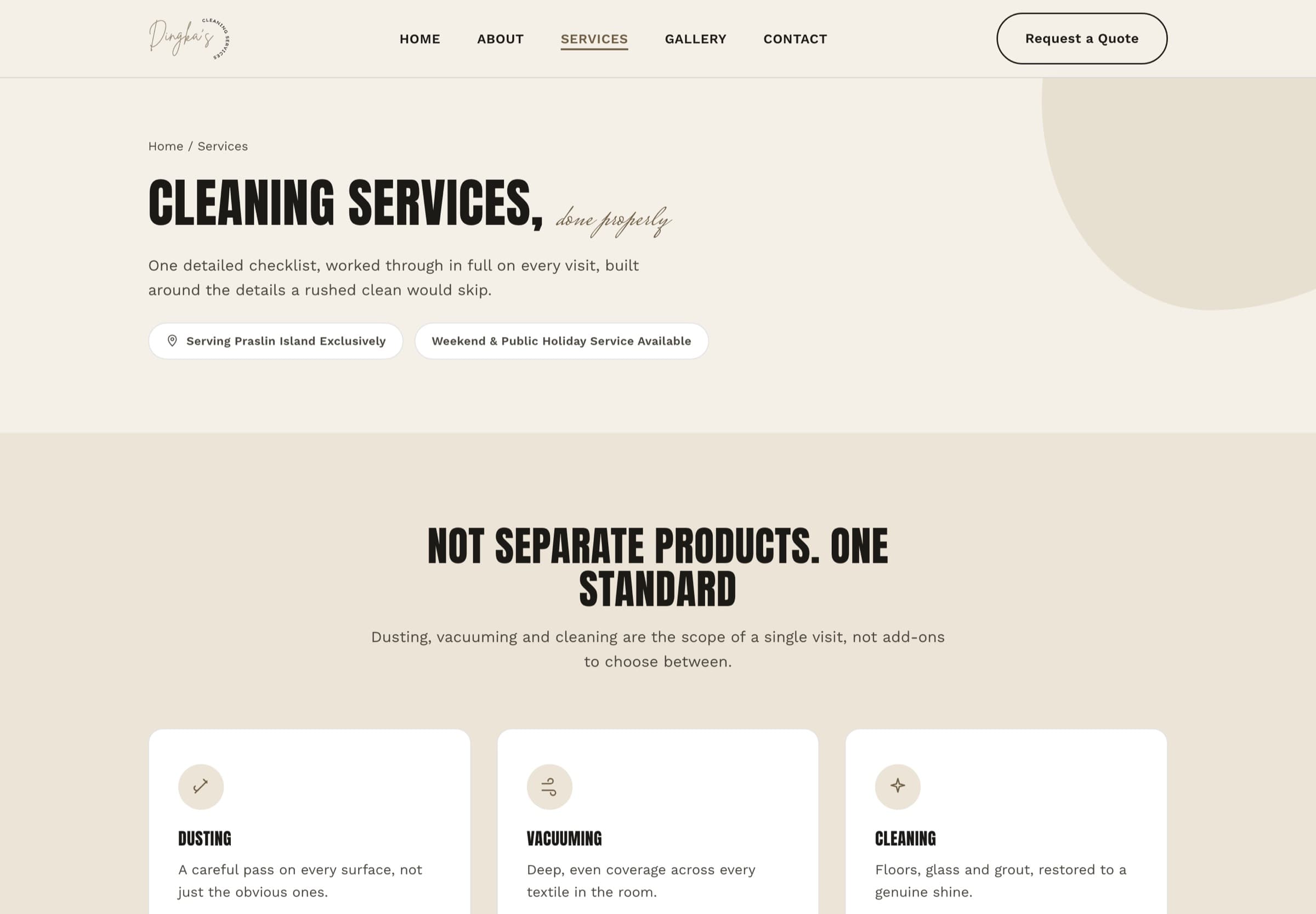
I planned the structure before drawing anything. The five pages — home, services, gallery, about and contact — follow the order in which somebody actually decides whether to call: what this is, what it covers, what the result looks like, who is behind it, how to reach them.
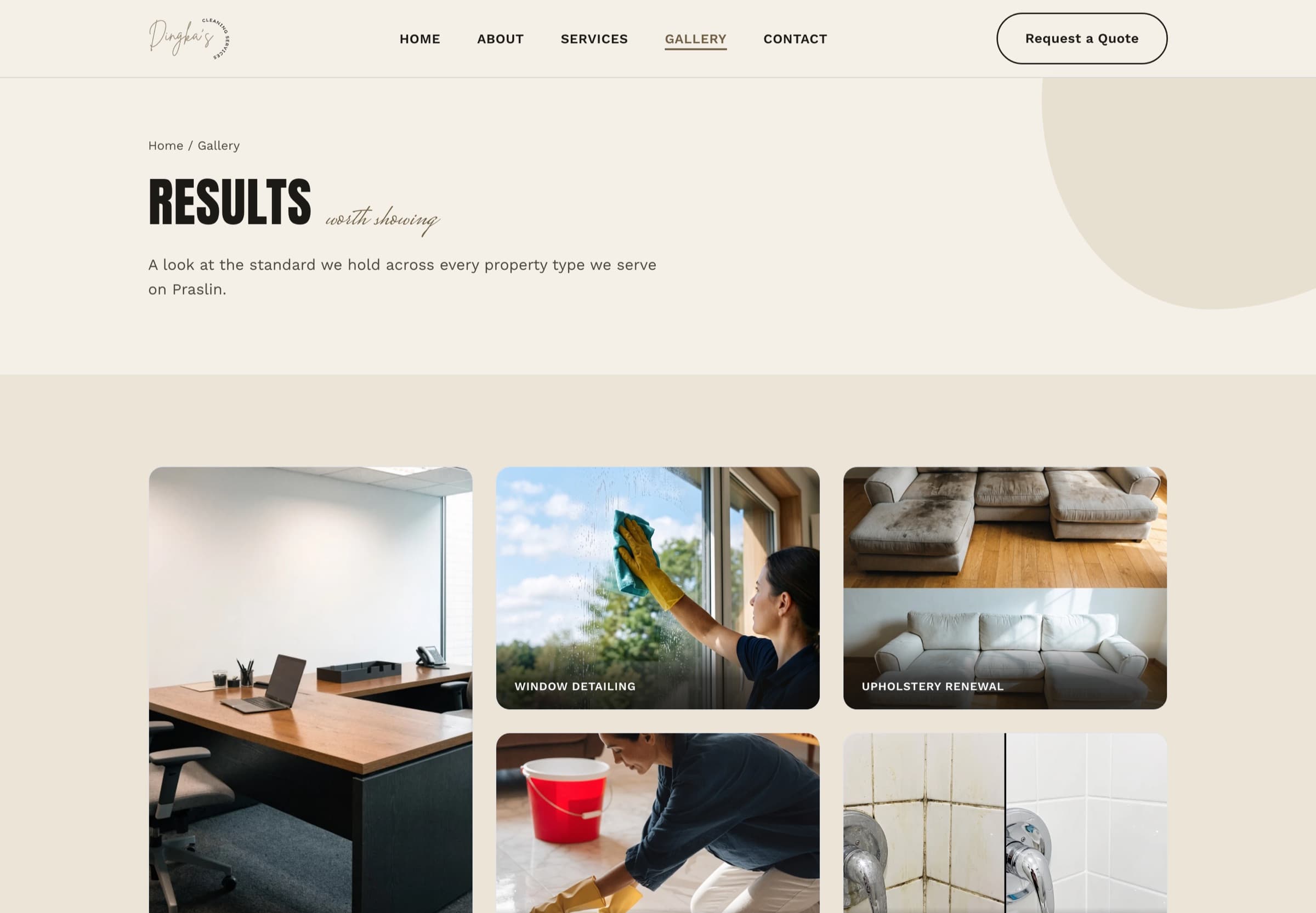
Content was structured and refined rather than rewritten wholesale, so the site still sounds like the business rather than like its designer. The gallery carries the persuasive weight that photography does better than any paragraph, and every other page stays short enough to finish.
Key decisions and features
- Service area and exclusions stated on the home page, not the footer
- Property types named in the visitor’s own language
- Weekend and public-holiday availability treated as a headline fact
- Page order matched to the sequence of a real booking decision
- Static pages, so local search reads real HTML without waiting on scripts
- Imagery optimised and sized for the slot it appears in
- Typefaces served from the site itself rather than a third party
- Local-business structured data, and a contact form on every route to it
The site itself
What was included
- Website strategy and sitemap
- Individual design direction and typography
- Content structure and refinement
- Responsive development
- Contact and enquiry form
- Local-business structured data
- Performance and accessibility checks
- Launch preparation